Mind the gap
February 2024 / 2037 words / headerimage © Axp Photography, pexels
Joint, gap, crack, fissure, opening, furrow, notch, chink, interruption, interspace, distance, pause, fissure, tear, hole, slit, incision - we know many words for something that doesn't fit or where something is missing, separated. It is time to discover the creative potential of the gap.
Everything is supposed to be seamless - our CVs, city facades, even our teeth. But who hasn't discovered something important between the lines, or longed for a break? The pandemic has taught us that gaps and pauses, even forced ones, are sometimes vital. But little of that has remained. Once again, we are eager to fill the gaps as quickly as possible. During the pandemic, social distancing was essential to staying healthy. In road traffic, too, we need more distance to avoid accidents. But as soon as a gap is big enough, it is closed - so much so that we have even developed small cars to fill the smallest gaps. Can a gap have a positive side? Interestingly, throughout our cultural history, the gap between two front teeth has often symbolised beauty and happiness. On the other hand, a gap always remains open because it is necessary due to the use of different materials - a constructive gap. I will leave out the musical fugue here, as it does not fit the theme. The variety of word creations and interpretations is amazing anyway. However, I would like to concentrate on the gap and the space, because these are the two terms that best describe a design concept. I am fascinated by the space in between. What happens if we leave this space free - neither to build on, nor to fill in, nor to use in any other way?
Design is about mastering the surface, the space. That's what we designers are trained to do. And yet the freelancer we brought from Frankfurt to Hamburg surprised us. His speciality was to be very economical with the elements and very open with surfaces and spaces. He mastered the tension in surface design so well that an unusual quality emerged that I had never seen before.
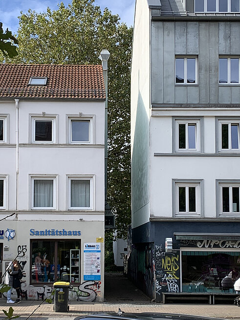
Most creative people are professionally involved in closing gaps. Architects are outdoing each other with creative solutions for closing gaps between buildings. The article '50 years of building in gaps between buildings in Cologne' by Uta Winterhager in the magazine 'moderneRegional' is interesting. Students should also consider the usability of gaps and in-between spaces during their studies. With 'Geh mal dazwischen', the Burg Giebichenstein School of Art in Halle challenged budding industrial designers to fill empty spaces with a practical use and visual appeal. Shouldn't we start seeing beauty in empty spaces? Exactly, the courage for the gap. From the necessary or the accidental to the principle.

Space or gap
As a long-time employee of the international design agency Interbrand, including several years under the direction of Swiss design legend Jörg Zintzmeyer, the term 'Spaltmaß’ has not escaped me. Originally a German engineering principle, it has become a term of respect for precision in the development and application of design principles.
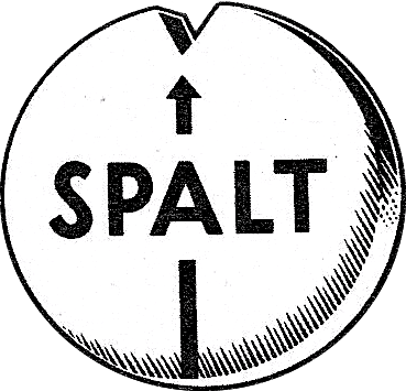
‘Setting the Spaltmaß’ and ‘Courage for the gap!’ are terms that are used in different contexts at first glance, but share surprisingly similar principles in design, whether in automotive design, graphic design or music. The German term ‘Spalt’ cannot be translated properly.
The ‘Spaltmaß’ (or gap dimension) is originally a technical term used in automotive engineering to describe the distance between neighbouring components. They are precisely manufactured gaps that ensure doors close smoothly, bodywork elements are securely connected, and wind noise is minimised. It refers to the precise fit of parts to ensure smooth function and aesthetics. In this context, the ‘Spaltmaß’ symbolises the need for precision and accuracy in design.
While the gap dimension was initially an engineering requirement, over time it became clear that this technical necessity has an aesthetic dimension. The right choice of gap dimension can help to improve the overall appearance of a vehicle and create a harmonious overall impression.
The ‘Courage for the gap!’, on the other hand, is more of a creative concept that describes the deliberate use of empty spaces or gaps in the design. In various creative disciplines, whether in graphic design, text design or music, this courage to leave gaps is used to create space for interpretation and emotional resonance.
The connection between ‘Spaltmaß’ and ‘Courage for the gap!’ lies in the fact that the originally technical concept of gap dimensions has taken a creative turn in design. Designers consciously use gap dimensions not only as a technical requirement, but also as a creative element. In this context, the ‘Courage for the gap!’ means not only seeing technical precision, but also recognising the gaps between the components as consciously designed elements that influence the aesthetics and effect of a design.
Both terms thus reflect the idea that gaps, whether in automotive design or in other areas of design, should not necessarily be seen as a negative point. Instead, they can be seen as an opportunity for creative development and as an integral part of the overall work of art. In this sense, the ‘Courage for the gap!’ can be understood as an extension of the technical gap into the creative and aesthetic dimension. In addition, the correct 'Spaltmaß' (spacing) should not be missing, even with intentional gaps.
Automotive Design
In the field of automotive design, the 'Spaltmaß' has evolved into a kind of creative canvas. Designers deliberately employ larger or smaller gap dimensions to achieve specific visual effects. For instance, a broader gap can convey a sense of robustness and solidity, while a narrower gap creates a more elegant and fluid appearance. The art of gap dimensions lies not only in technical precision but also in the intentional influence on the viewer's perception.
The inspiration for considering gap dimensions as a design element goes back a long way. Already in the architecture of the Bauhaus and in industrial design of the 1950s, emphasis was placed on clear lines and precise distances. Today, the approach of 'Courage for the gap!' echoes the idea that voids are just as important as what surrounds them. In the world of automotive design, this courage encourages us not to view gap dimensions as a necessary evil but rather as consciously crafted elements that shape the identity of a vehicle.


Graphic design
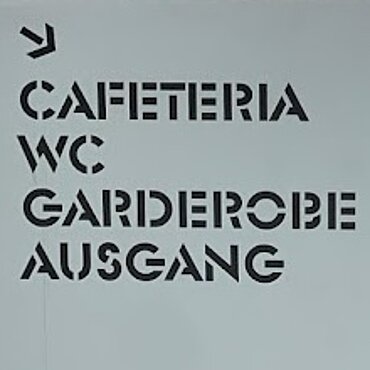
In the world of graphic design, gaps are comparable to white space, which influences visual hierarchy and legibility. Generous use of white space can draw attention to certain elements, while precisely placed gaps in layouts strengthen the structure. The ‘courage for the gap!’ allows designers to play not only with colours and shapes, but also with the space in between to create a balanced and appealing overall picture.

Layout and text
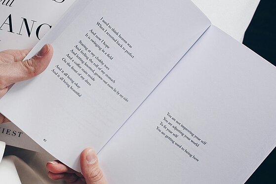
Spacing also plays an important role in text design. However, we should not be talking about columns or spaces here, because space text is something different, but about typographic white space. Following the design principle of form against form, the correct distribution of print area and white space is a design challenge for the designer. Well-placed white space improves legibility and requires less concentration to read.
Spacing between paragraphs improves readability and helps to convey information effectively. An overall increase in line spacing makes reading easier, especially for screen content. Readers are more likely to read if the first line is indented. This indention organises longer texts and avoids lead deserts. Subheadings and images, as well as quotations or set-off text, help the reader and break up the text visually.
The deliberate use of space creates an inviting atmosphere and guides the reader through the text with pauses and emphasis. The 'courage to leave gaps' opens up space for interpretation and emotional resonance in text design.

Architecture and urban planning
In architecture and urban planning, the "courage for the gap" becomes the "luxury of gaps". In most cases, the aim is to close gaps, increase density and optimise the use of building land. In a world of constant growth and constriction, the targeted creation of open spaces is a bold design decision that not only provides visual relief, but also promotes a healthy urban dynamic. This bold approach opens up the possibility of creating architectural compositions with generous open spaces that are not only aesthetically pleasing, but also promote the quality of life and functionality of urban spaces.
The three-dimensionality of architecture and urban design offers open and intermediate spaces in a fascinating dimension. Vertical expansion makes it possible to create open spaces not only horizontally but also vertically, be it through inner courtyards, green terraces or skilfully designed spaces between buildings. The view upwards not only creates visual expanse, but also conveys a feeling of airiness and openness.
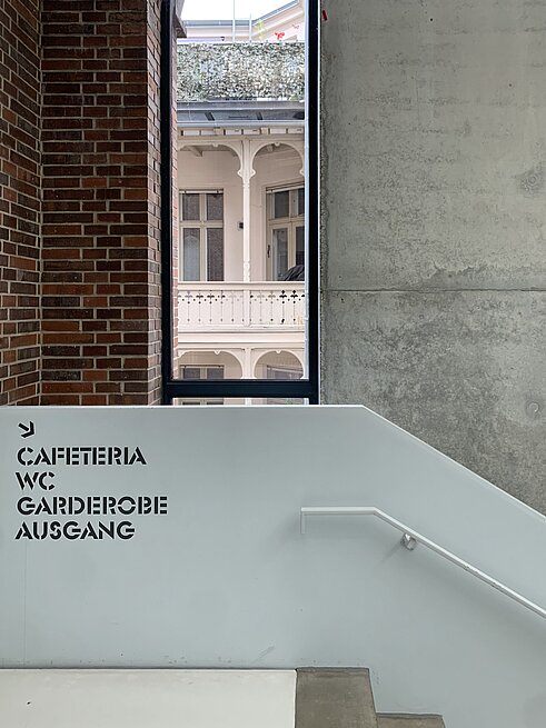
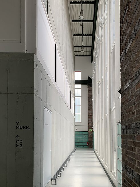
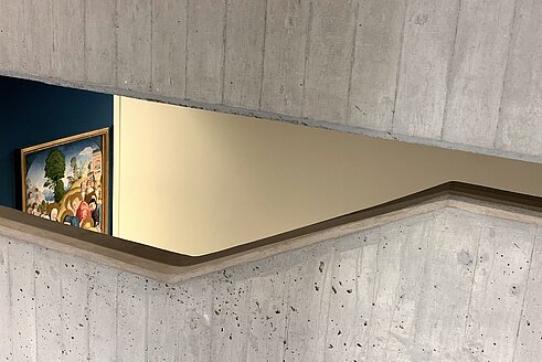
BLMK Cottbus Germany. Gaps between old and new building sections.
Music and musical composition
In music, the ‘Courage for the gap!’ is comparable to the pauses and the silence between the notes. The silence between the notes is just as important as the notes themselves. Musicians consciously utilise the power of the pause to build up tension and intensify emotions. The ‘Courage for the gap!’ in musical composition makes it possible to create a unique sound atmosphere through rhythm and silence. What lies between the notes makes music lively and expressive.
And as the French composer Claude Debussy said: “Music is the space between the notes”.


In all these creative areas, the ‘Courage for the gap!’ becomes a creative tool that not only fills empty spaces, but consciously uses them to tell a story, convey emotions and create a connection to the viewer, reader or listener. The art lies not only in looking at what is there, but also in recognising what lies in between as an integral part of the overall work of art. It is the space between the elements that reveals the magic of the design and invites the viewer or listener to fill in the gaps with their own thoughts and interpretations. //rb
Remark
My motivation to write about this topic stems from my time at Interbrand. BMW was our client for a long time, and the gap dimension was an important measure in automotive design. For us, the gap dimension became a common term to describe our precision in design.
The term 'courage to leave a gap' is also used in other contexts. For example, in the sense of 'not needing to know', i.e. the courage to leave a gap in knowledge. The related call to accept one's own imperfection comes from the field of education in connection with the concept of 'exemplary learning'.
In our article, we understand the term as an invitation to create gaps, spaces and freedom for a better and holistic artistic quality. The gap becomes an independent element, initially invisible and inaudible. When you become aware of the gaps, you learn to see white spaces and hear pauses. 'Courage to leave a gap' does not mean to enlarge the gap, but to place it consciously. The courage to leave a gap = creating distance, making the invisible visible.
The term gap is also used in relation to us humans and our social behaviour. A quote: There are people who are constantly bumped into in the street, and no one answers their questions, even if they have asked them three times. They are like a void, a pause, a gap, an absence - they are invisible. (Julia's Eyes, 2010 US thriller).
The gap filler is something or someone that is used for something in the absence of something better or more suitable.
The gap filler is a didactic method to increase the students' attention when working on a text (cloze text).