
Beautiful logo, isn't it?
January 2024 • 1018 words • header image © Unsplash Douglas Bagg
We may think that a logo has to be beautiful to be successful. But what really matters? Discover why aesthetics aren't everything and what really makes a good brand logo.
Hand on heart: would you say that the BMW logo is beautiful, or that it actually radiates the joy it promises? The IKEA logo, with its bold letters and banal oval, looks like the worst example of Scandinavian design culture. IBM's dotted letters also look as if they are about to disintegrate - a dubious image for intelligent silicon. McDonald's slender M, known as the Golden Arch, contrasts with the greasy food on offer. And the Lidl logo? Just look away.
Why should three stripes be better than two? In my youth, I remember broken Mercedes stars that were even misused as brass knuckles - a logo that literally leaves scars.
But beyond such negative associations, all these logos have one thing in common: they create identity. They conjure up images in our minds, are unmistakable in a sea of signs and symbols, and are recognised around the world.
And they don't necessarily have to be 'beautiful'. A logo doesn't even have to match the product perfectly to be successful. But what does it need?
Logos - whether lettering or symbols - are 'learned signs'. Like the vocabulary of a language, we learn their meaning through constant repetition. Their memorability and distinctiveness are crucial to learning. A logo has to stand out from the rest, it has to stand out, it has to attract the eye. Sometimes even the supposedly ugly can help by challenging our aesthetic sensibilities. Simply because it distracts.
It's the story
So far, so good. But we want to go further. At a workshop in Berlin, our Creative Directors team tried to create deliberately ugly design. The aim was to gain a new perspective on beauty. The idea came from our HR developer. The success was modest. We designers are not trained to make things ugly.
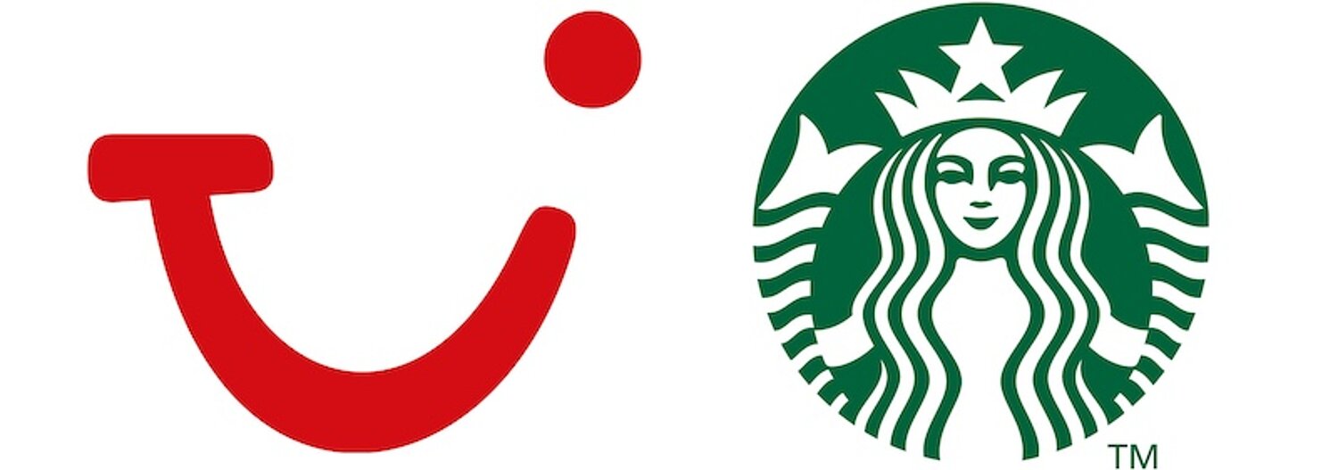
We envy the inventors of the TUI logo. It forms a smile out of three letters. And of Starbucks' stamp-like, seductively smiling mermaid, which even has two flippers. But it's not the shape that touches us. It's the stories behind them. The TUI logo, by the way, was not the work of a designer. It was the idea of a marketing intern who scribbled her sketch on a post-it note.
So you don't necessarily need a designer to create a good logo. But an idea is essential. The rest is craft.
Stolen on purpose
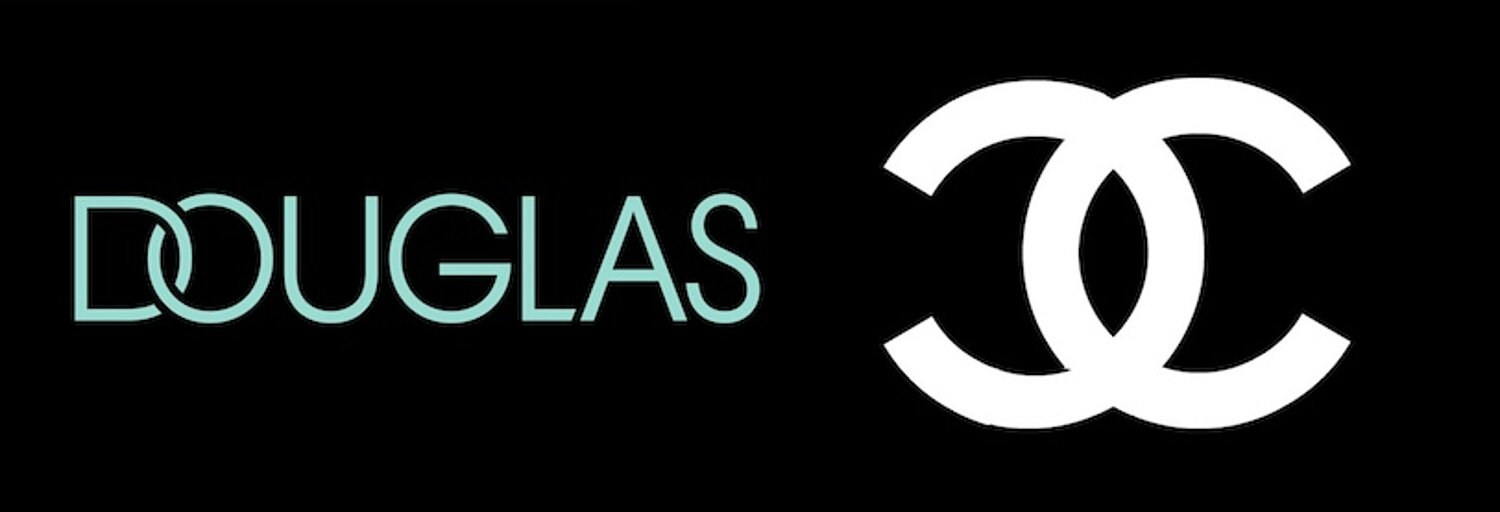
In a statement to the trade magazine Horizont, a creative director describes the new Douglas cosmetics logo as aesthetic and beautiful. She does not want to criticise her colleagues from the Hanseatic city. But two letters intertwined in a circle is nothing more than a copy of the Chanel monogram. At least their shape gives the eye something to linger on - like the broken slats in the fence.
Various German design experts can talk at length about the design quality and balance of the lettering, which looks more like a series of letters. But really, it's all about the skill of the executing hand - the craft that designers should master. The lettering almost screams its own category of beauty and doesn't seem to need an idea of its own. That's right! As the hallmark of the House of Beauty Brands, it doesn't want to compete with the brands, it just wants to give them a stage, Chanel included.
To die in beauty
As impartial consumers, we accept a logo as it is. Because something happens at the moment of perception: associations and images arise in our minds - exactly what the owner of the logo wants to achieve. We drive with it or carry it around with us and feel a sense of belonging. A logo is a figurehead and a signpost at the same time. After all, we usually only perceive it subconsciously.
Designers often have a reputation for only quoting what has worked and is generally considered beautiful. They win awards for good design, which unfortunately is not commercially successful and often only suitable for the portfolio. Of course, designers are people of the eye and can tell stories with images and signs. But can they also invent new ones? They see more than they read and are aesthetically trained. But you don't necessarily need that for logos.
What's more, what is supposed to be beautiful is often overlooked anyway, gets lost in the daily grind or depends on the viewer's taste. There is a great danger that a logo can be beautifully designed, but become banal and overlooked for that very reason. Die in beauty - to die in beauty" or "too slippery to grip". At n-tv you can vote on whether you think the new logo of BMW is chic or ugly. They don't seem to have thought of any other way to judge it.
The logo affair at the American fashion chain GAP shows how strongly brand identity is linked to habits and emotions. When GAP unveiled its new logo, it caused a storm of controversy. Customers did not feel connected to the modern lettering. The old logo, with its widely spaced letters, was familiar and had become an emotional brand over the years. Returning to the old design was therefore less a question of aesthetics than a commitment to the tried and tested. The case is a reminder that established brand images and symbols should not be abandoned lightly - a form of inner beauty that comes from familiarity.
Link: https://www.n-tv.de/auto/Neues-BMW-Logo-schick-oder-haesslich-article21618089.html
Link: www.thebrandingjournal.com/2021/04/learnings-gap-logo-redesign-fail/
Everything but beautiful
One thing is clear: a logo does not have to be beautiful. Its success depends on other factors. It has to be functional, recognisable - large or small, on buildings or the Internet, on any background. It has to be accepted in a cultural, social and business context, as well as by the general public. And it has to be transferable to products and services. We only find it beautiful because we find what it stands for beautiful and important.
Remark
Die in beauty. The phrase comes from Henrik Ibsen's drama 'Hedda Gabler' (III, 7), in which the title character, Hedda Lövborg, who is about to end her life, hands over one of her pistols with the macabre remark that he should carry out his suicide 'beautifully'.
Today, the phrase is used colloquially to express that something is not succeeding despite its good qualities. In sport, for example, when a team plays well but loses because of a lack of determination.
In design, it refers to something that is pretty or decorative, perhaps even up to scratch, but lacks the substance or grip to be truly memorable - something that is nice to look at but commercially unsuccessful, or a good idea that unfortunately doesn't catch on.
Fancy more?

A new logo is needed
When is it worth investing in a new logo?
